VISA FINANCIAL INSIGHTS
Financial reports have the answers. Finding them shouldn’t take 200 pages. 📑
Visa Financial Insights turns dense financial data into a visual story built for faster understanding.

Information & Visual Designer
Financial Data Storytelling
Infographic Design
Information Design
2026
Project Overview
Visa Financial Insights is an independent information-design concept that transforms dense financial reporting into a clear, engaging visual narrative. Using publicly available financial data, I developed an editorial system combining data visualization, infographic design, typography, iconography, and structured storytelling to make complex business information easier to scan and understand.
The Problem
Annual financial reports contain valuable insights, but important information is often buried within lengthy explanations, dense tables, technical terminology, and supporting notes. This makes it difficult for executives, investors, and non-financial audiences to quickly identify the most meaningful trends and comparisons.
91 %
Information condensed
12+ Insights
Key metrics surfaced
130+ Pages
Financial reporting analyzed

The Challenge
The challenge was not simply to make the data more visually attractive. I needed to preserve its accuracy and context while reorganizing it into a more intuitive narrative.
This required selecting the most relevant metrics, establishing a clear information hierarchy, choosing appropriate chart formats, simplifying financial language, and creating a consistent visual system that could work across multiple types of information.
Results & Impact
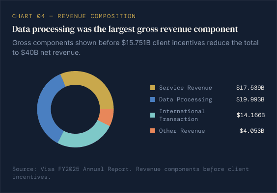
The final concept condenses key financial insights into a focused executive story organized around scale, growth, revenue, network activity, geographic performance, and strategic services.
A unified system of charts, KPI components, icons, labels, typography, and annotations makes the information more approachable while maintaining a credible financial-reporting tone. The project demonstrates how complex enterprise data can be transformed into a scalable and accessible communication experience.
Because this is a self-initiated concept, avoid claiming measured improvements in Visa’s real business performance or user comprehension.

Learnings
This project reinforced that successful data visualization begins with information architecture rather than decoration. Before selecting colors or chart styles, I needed to understand the relationship between each metric and determine the clearest sequence for presenting the story.
I also learned to balance visual simplicity with financial accuracy. Removing too much context can make data misleading, while including too much detail can recreate the complexity of the original report. Clear labels, source notes, accessible contrast, and concise explanations were essential for making the visuals both understandable and trustworthy.